11
Web + mobile page designs.
Case study, Streak
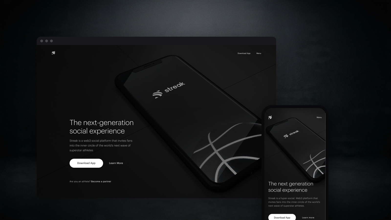
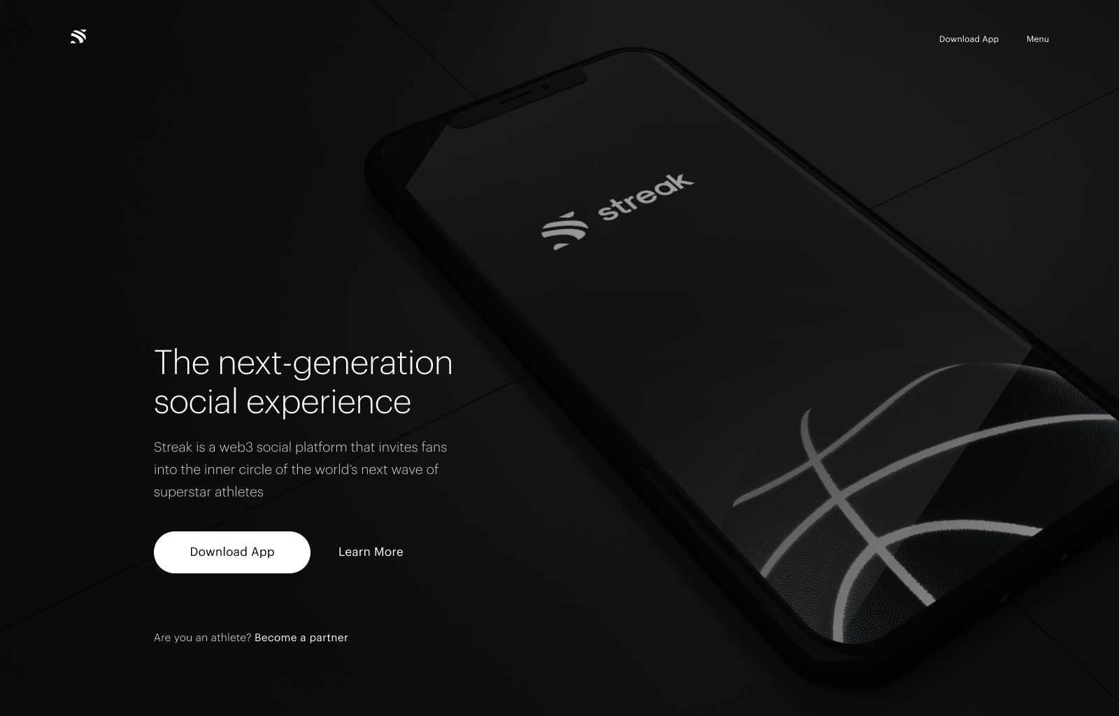
Streak is a fan-first sports platform, athletes own their story, fans get exclusive access to drops and moments. The app already existed with a complete design system. My remit was the marketing site that brings new fans and athletes into the product, without reinventing the brand it already owned.
01 · The brief
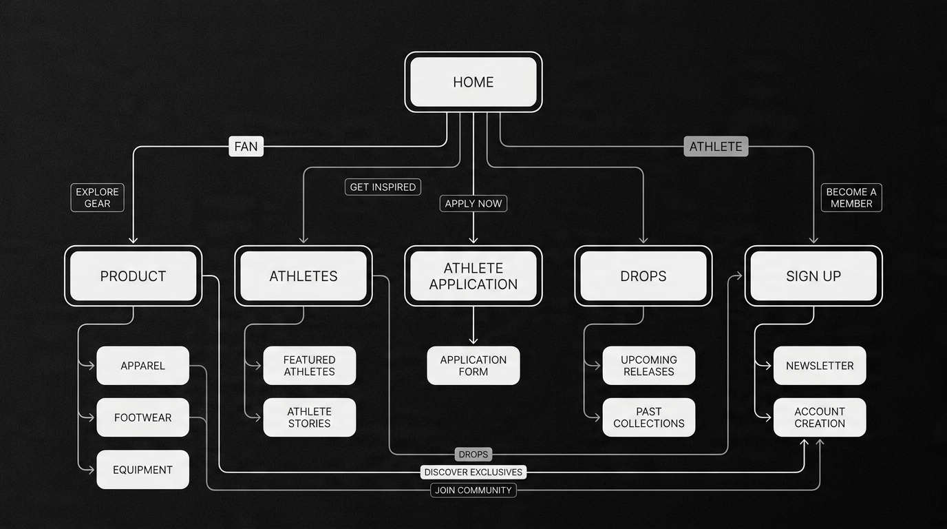
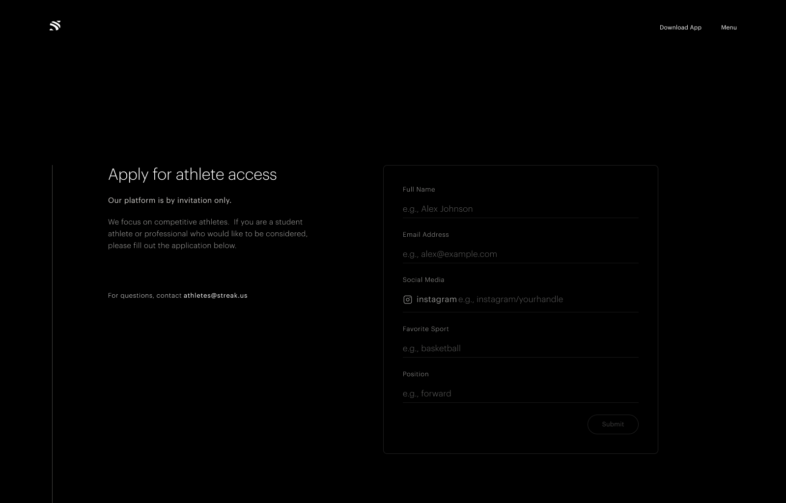
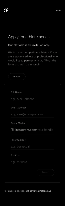
When I joined, the app existed and the team had built a complete design system around it: stark black-and-white surfaces, high-contrast type, cinematic athlete photography. The constraint was clear, don't reinvent, extend. I designed the site end-to-end (Home, Product, Athletes and the Athlete Application) across desktop and mobile, introducing new patterns only where the web genuinely needed them.
02 · Research & discovery
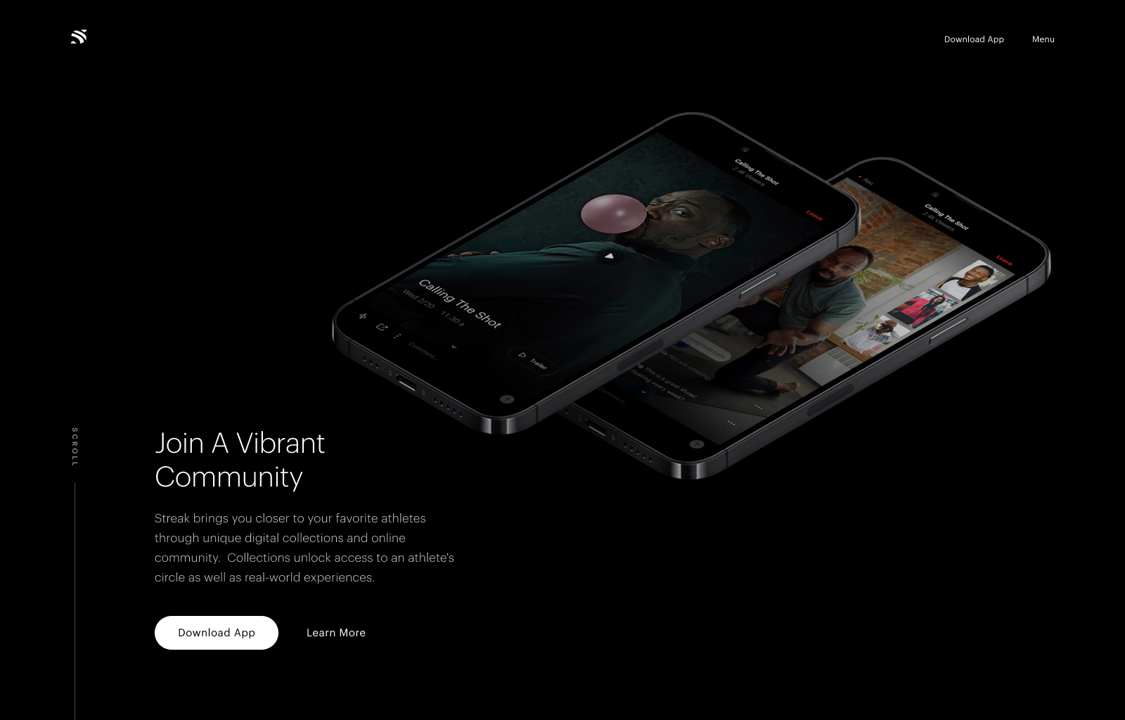
I started inside the app, its black base, monochrome contrast, type ramp, motion principles and athlete-led photography, then translated that language to a long-scroll marketing site that two audiences land on: the committed fan who needs the answer above the fold, and the rising athlete who needs a persuasive pitch and a low-friction application path.
Stay inside the existing system. New patterns only where the web genuinely needed them.
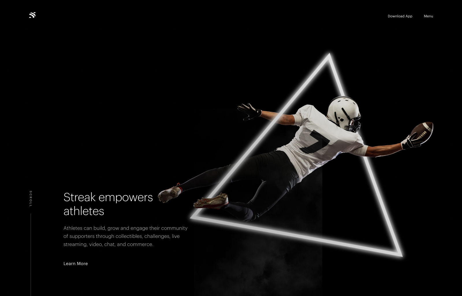
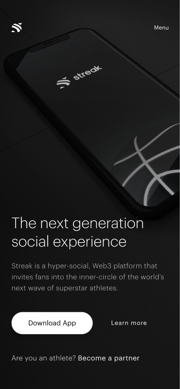
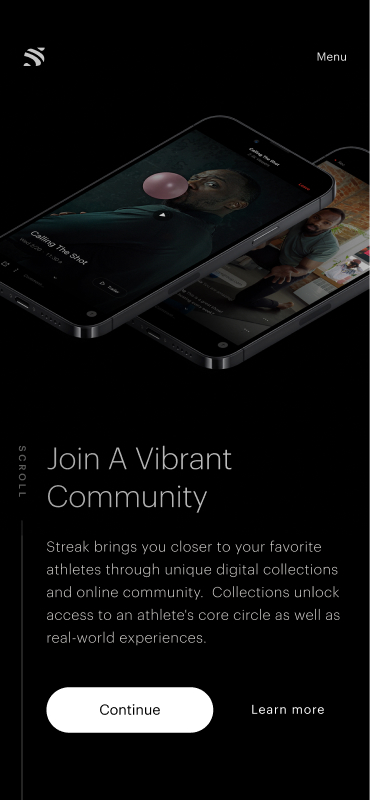
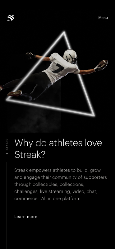
Without a product to demo, imagery carries the credibility. Every section is built around it.
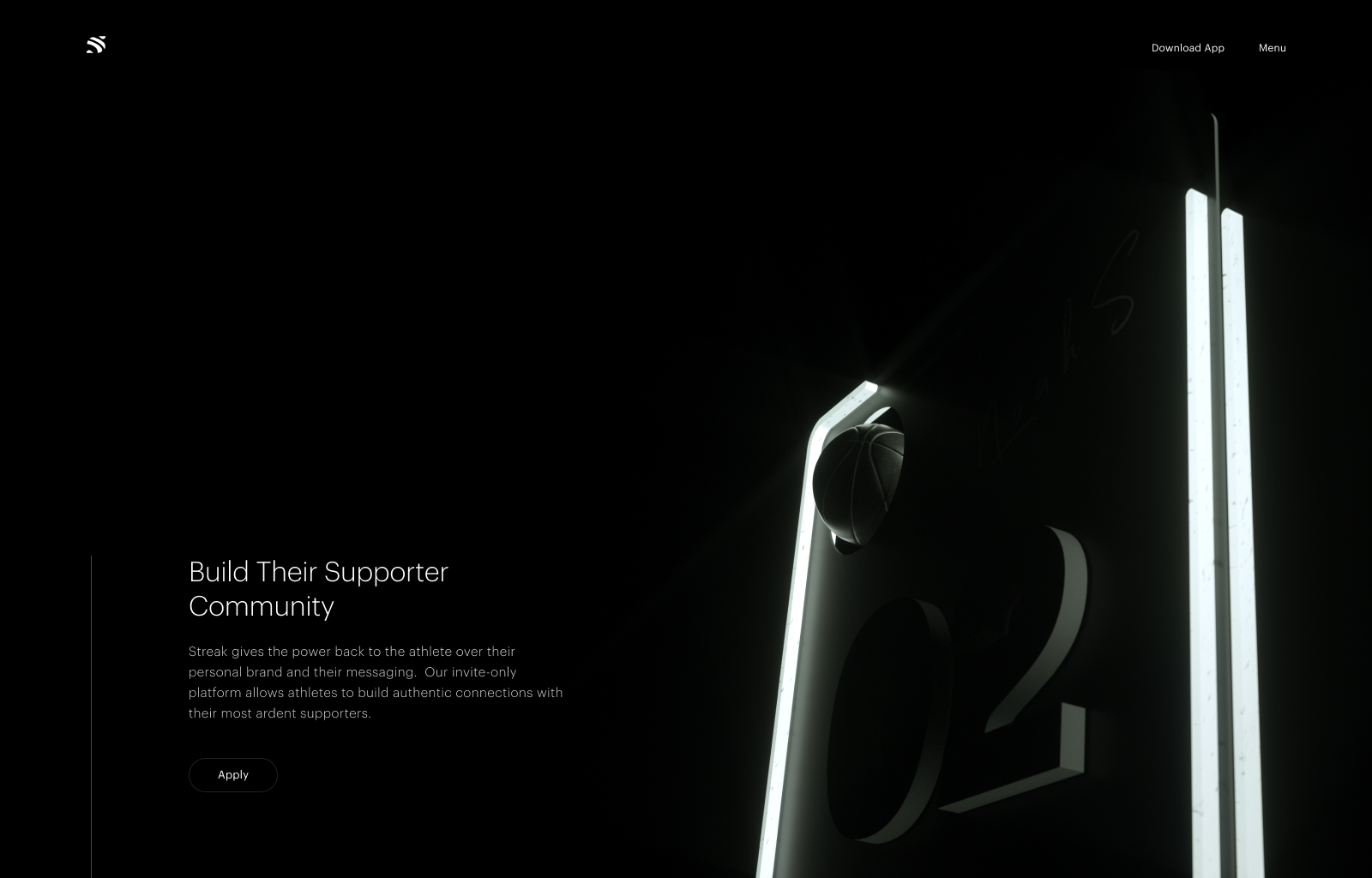
Every page reads to both. Athletes get a dedicated path, but the IA never forks.
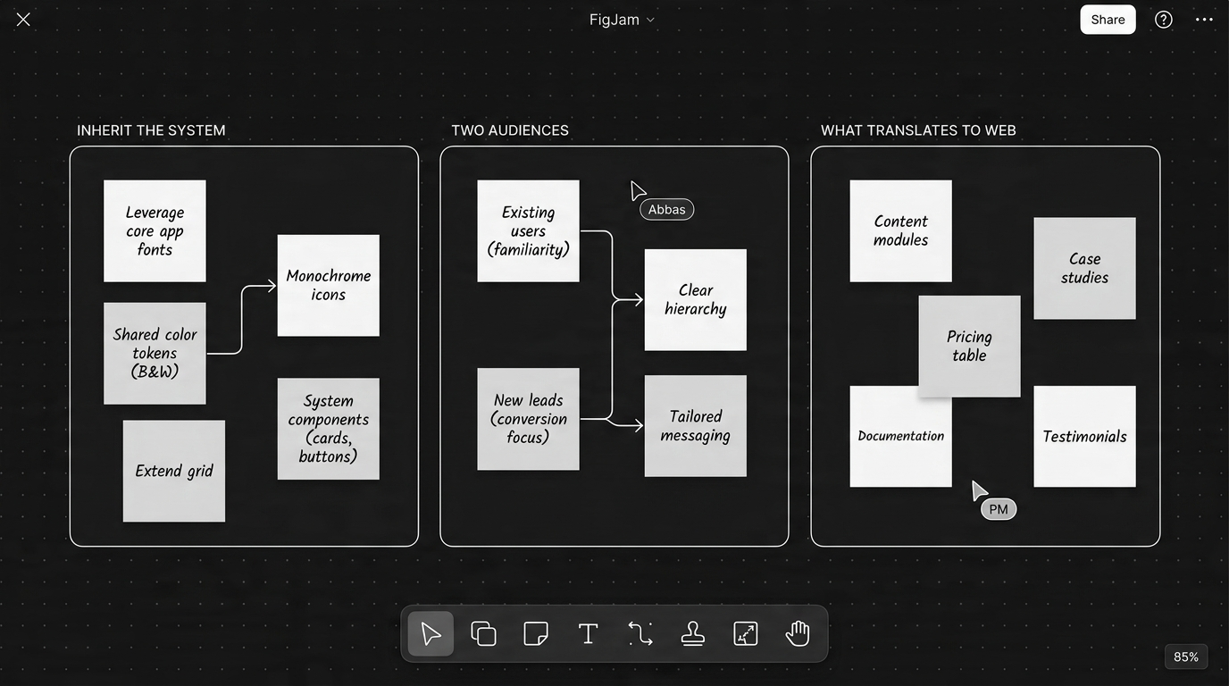
03 · Design process
Catalogued every component proven in product so the site would extend the language, not contradict it.
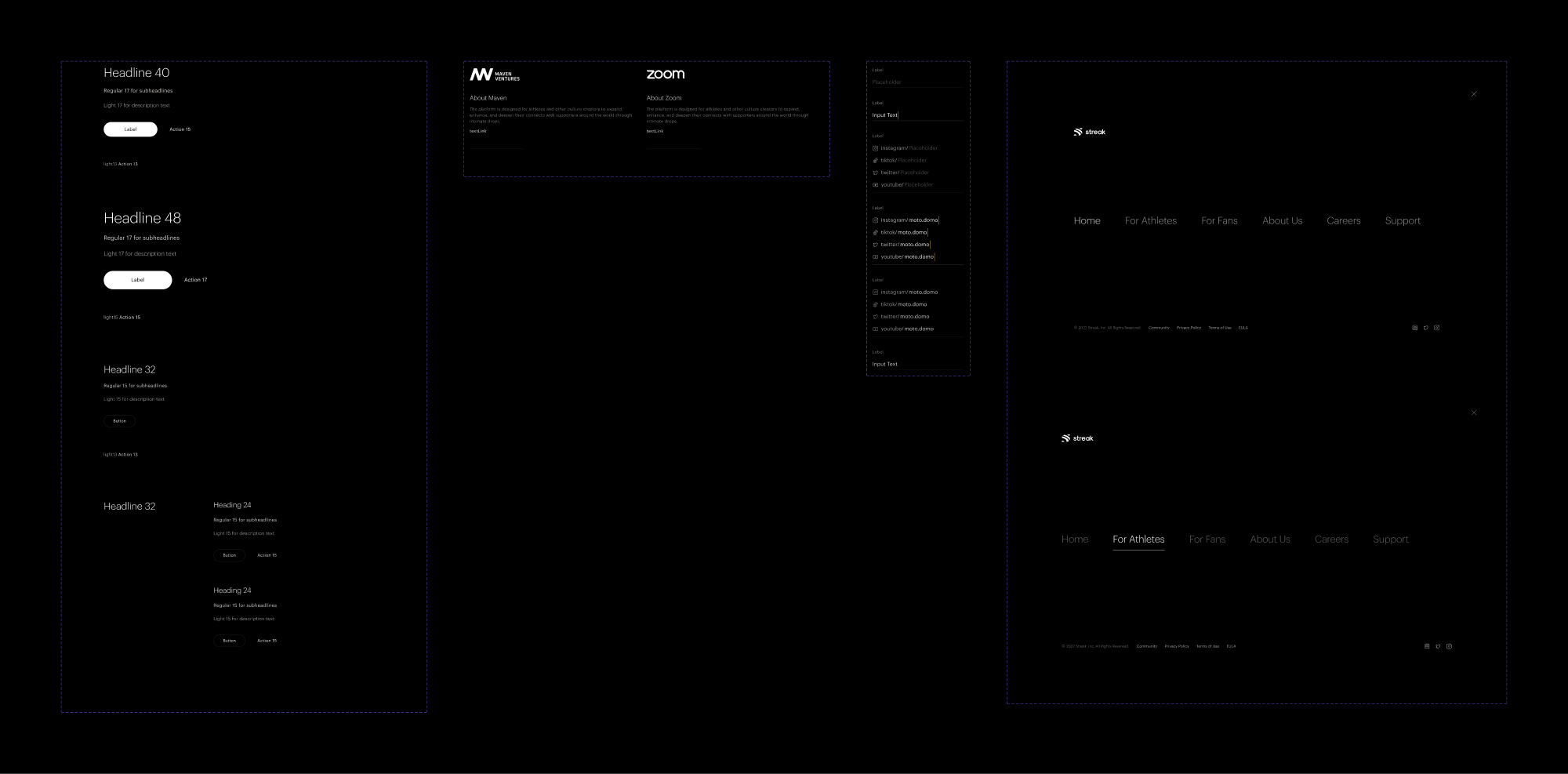
Scaled the type ramp up for hero sizes; introduced web-specific components (nav, footer, marketing modules).
Home, Product, Athletes and Application, designed to do the work the app couldn't.
Every desktop layout mirrored at mobile width, no diluted mobile version.
04 · The website, page by page
05 · Impact
06 · Learnings
Inheriting a system is harder than building one. Every choice has to earn its place against existing patterns. The work is in restraint, knowing what's proven and getting out of its way.
On a brand site, photography is the product. Without a UI to demo, every section earns credibility through imagery and typography.
Designing for two audiences on one canvas is a hierarchy problem. The IA never forks, but the priority order does, deciding what a fan and an athlete each need before they scroll.
The full UI screens and process work live in Figma, happy to give you a walkthrough.