500+
Certified trainers on the platform.
Case study, Fitlov
Fitlov connects users with certified personal trainers and wellness professionals on demand across Dubai, Abu Dhabi and Sharjah, personal training, yoga, boxing, swimming, nutrition and massage. I led the design of the entire product from scratch: UX strategy, UI, the design system and booking flows.
01 · Overview
The UAE fitness market is fiercely competitive, yet users kept hitting the same wall: difficulty finding credible trainers, no pricing transparency, fragmented booking, and low trust in online fitness platforms. Fitlov set out to fix this with a centralised, trusted marketplace built around a premium, mobile-first experience.
02 · Research & discovery
I analysed booking apps, wellness services and Uber-style on-demand models. One pattern ran through all of them: too much information, murky trainer credibility, and needlessly complex booking. Those insights shaped a simplified, trust-driven approach built on three principles.
Clear credentials, structured profiles and ratings make credibility obvious at a glance.
Minimal steps, simplified decisions, every screen has to earn its place.
Built for fast, thumb-first browsing and booking on the go.
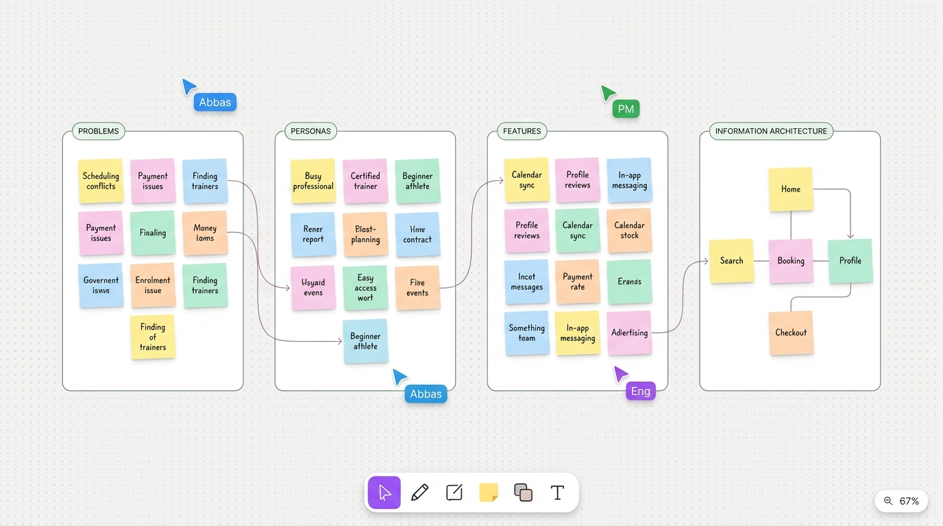
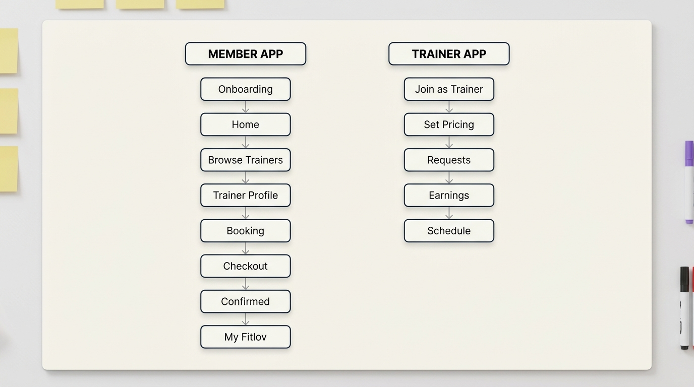
03 · Information architecture
Fitlov is a two-sided marketplace, so the architecture had to serve members and trainers in parallel, each journey kept shallow, with the shortest possible path from intent to action. The time-poor professional wants expert, flexible coaching without the gym commute; the independent coach wants flexible income and a steady stream of the right clients.
04 · Design process
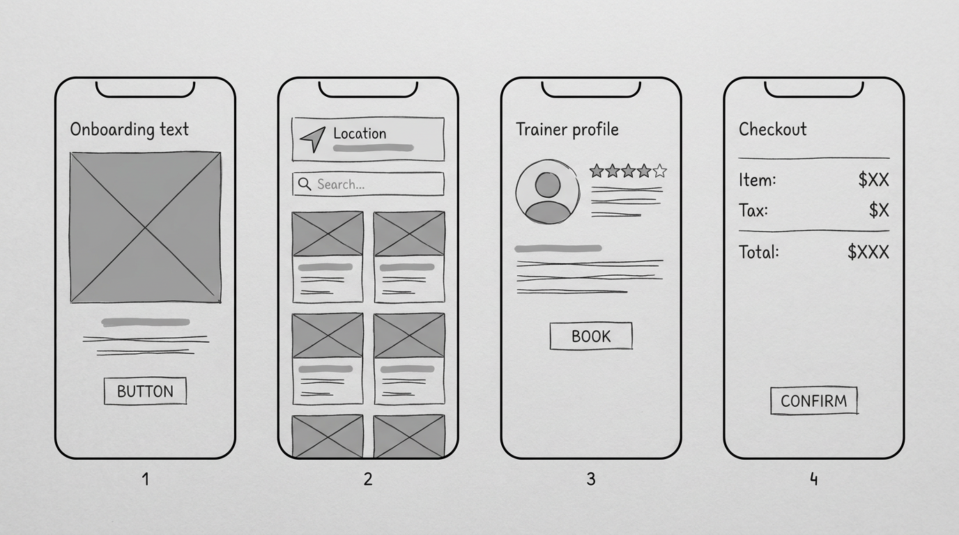
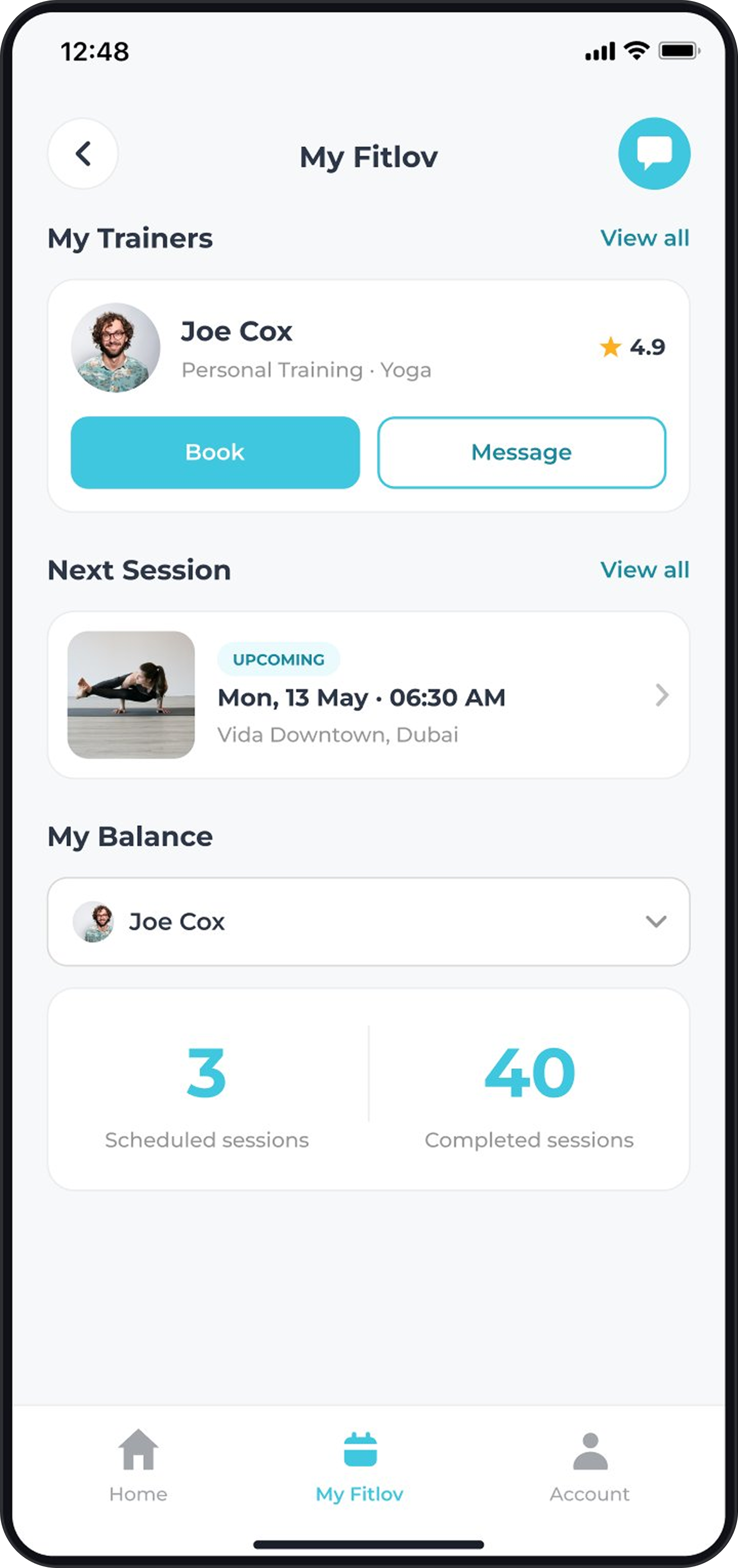
Structured around discover → profile → book → manage, the shortest path from discovery to booking.
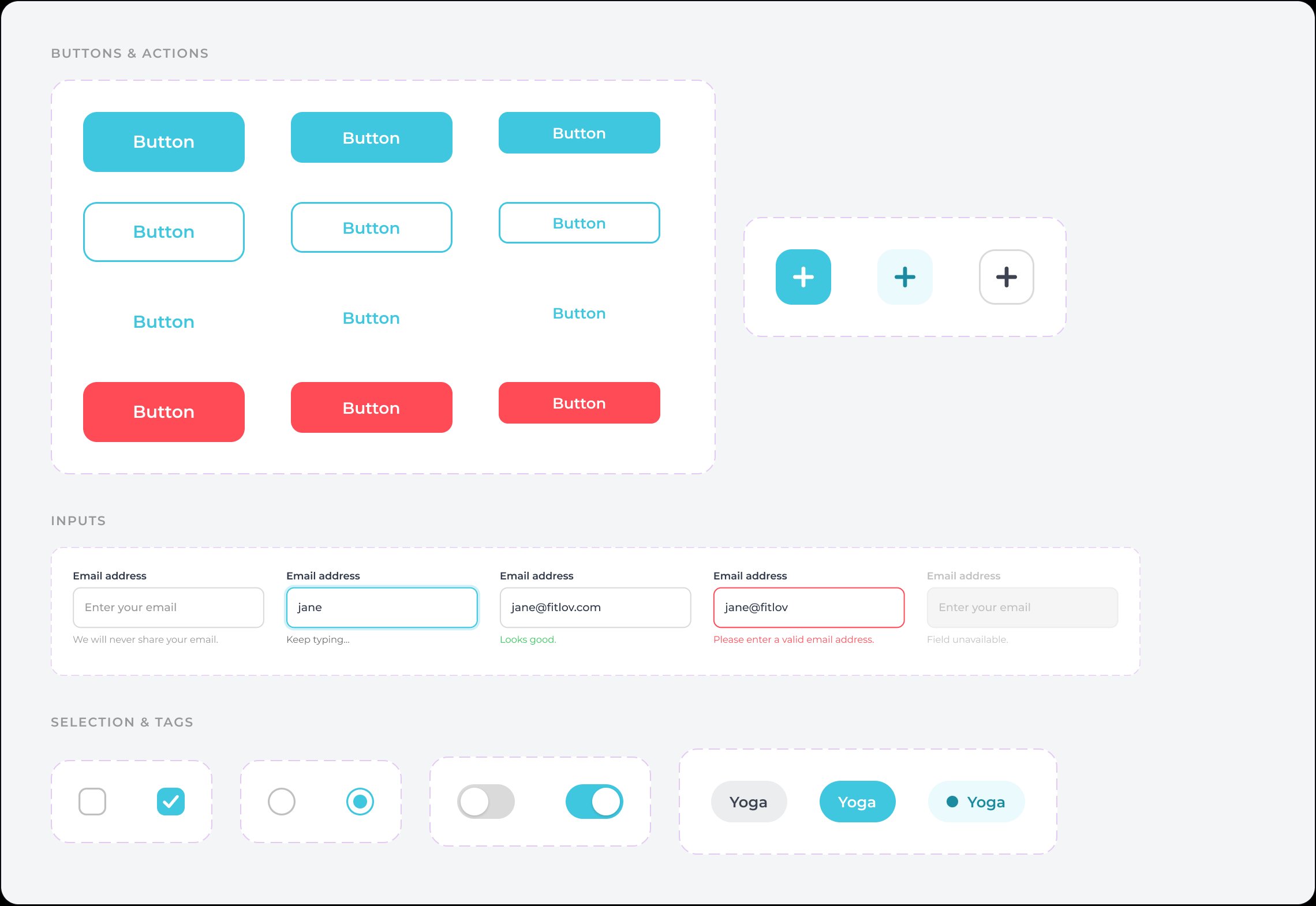
Type scale, colour, spacing, buttons, inputs, cards, navigation and states, so the product could scale into new categories.
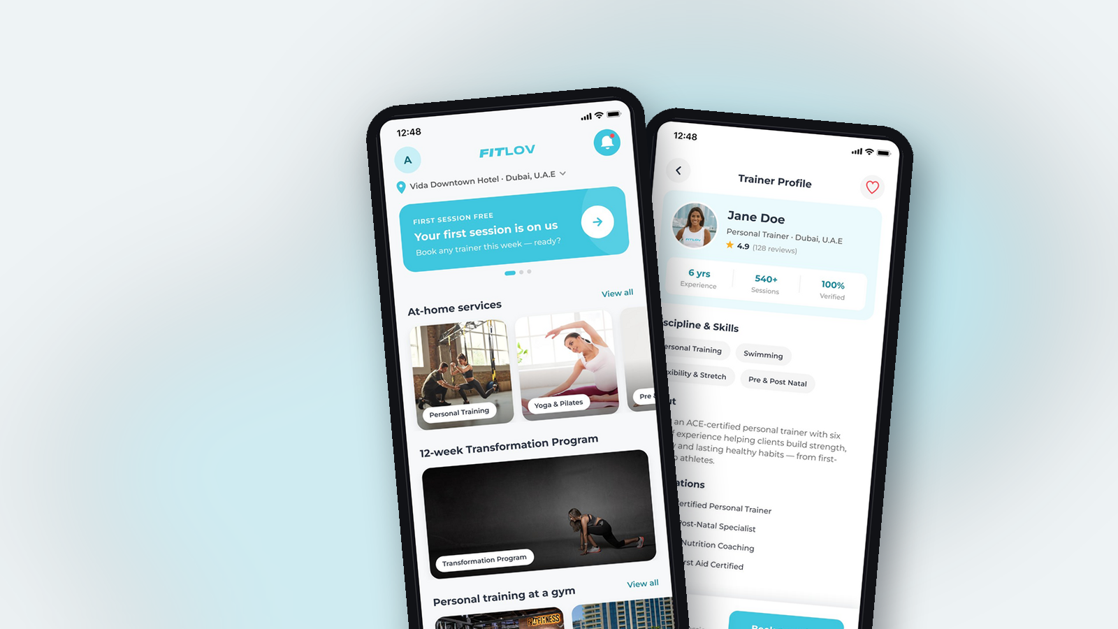
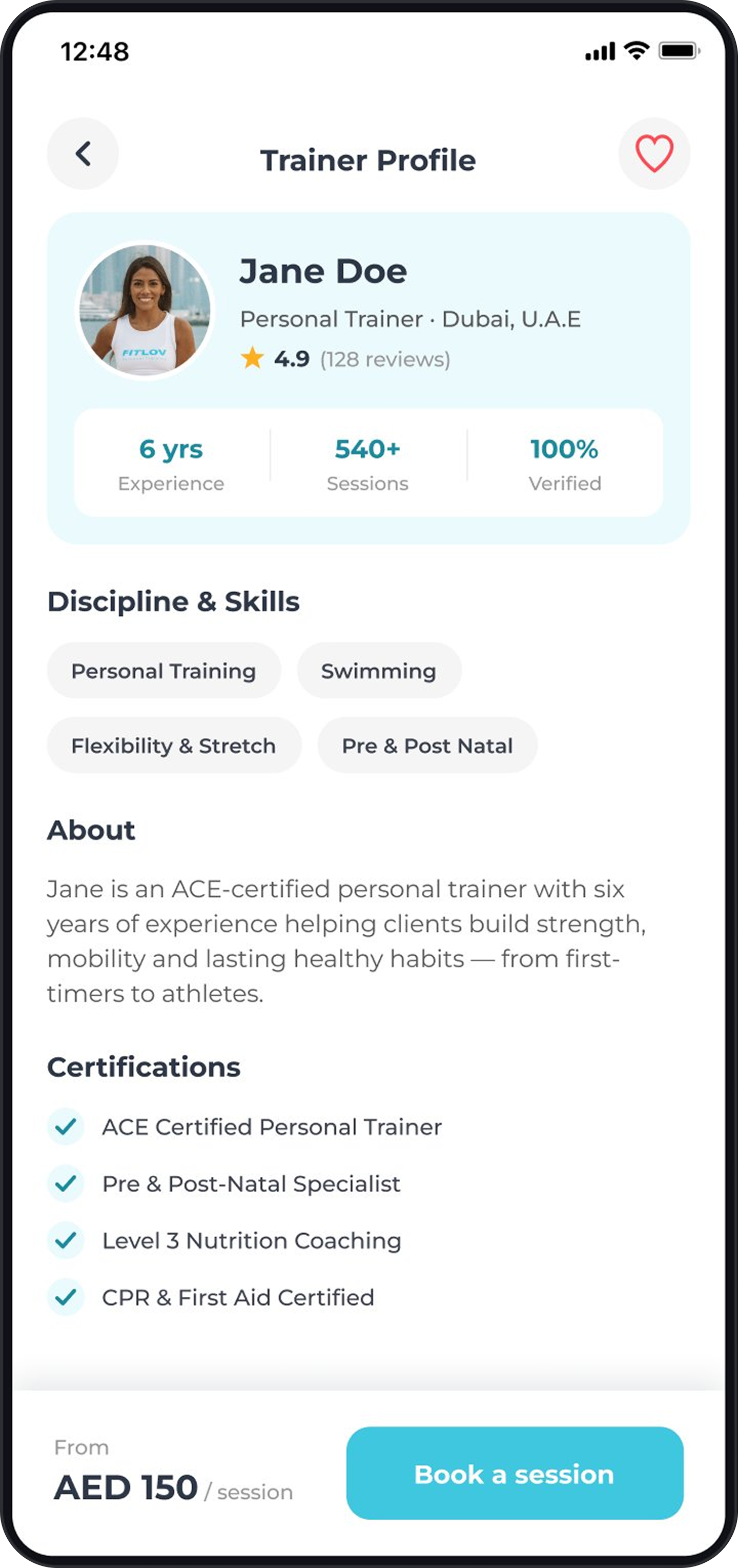
Structured browsing with filters; profiles engineered for trust, certifications, reviews, ratings and clear pricing.
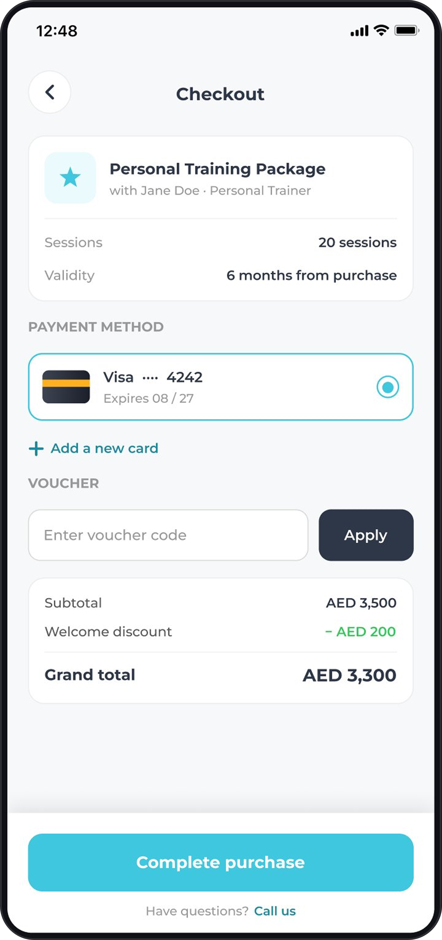
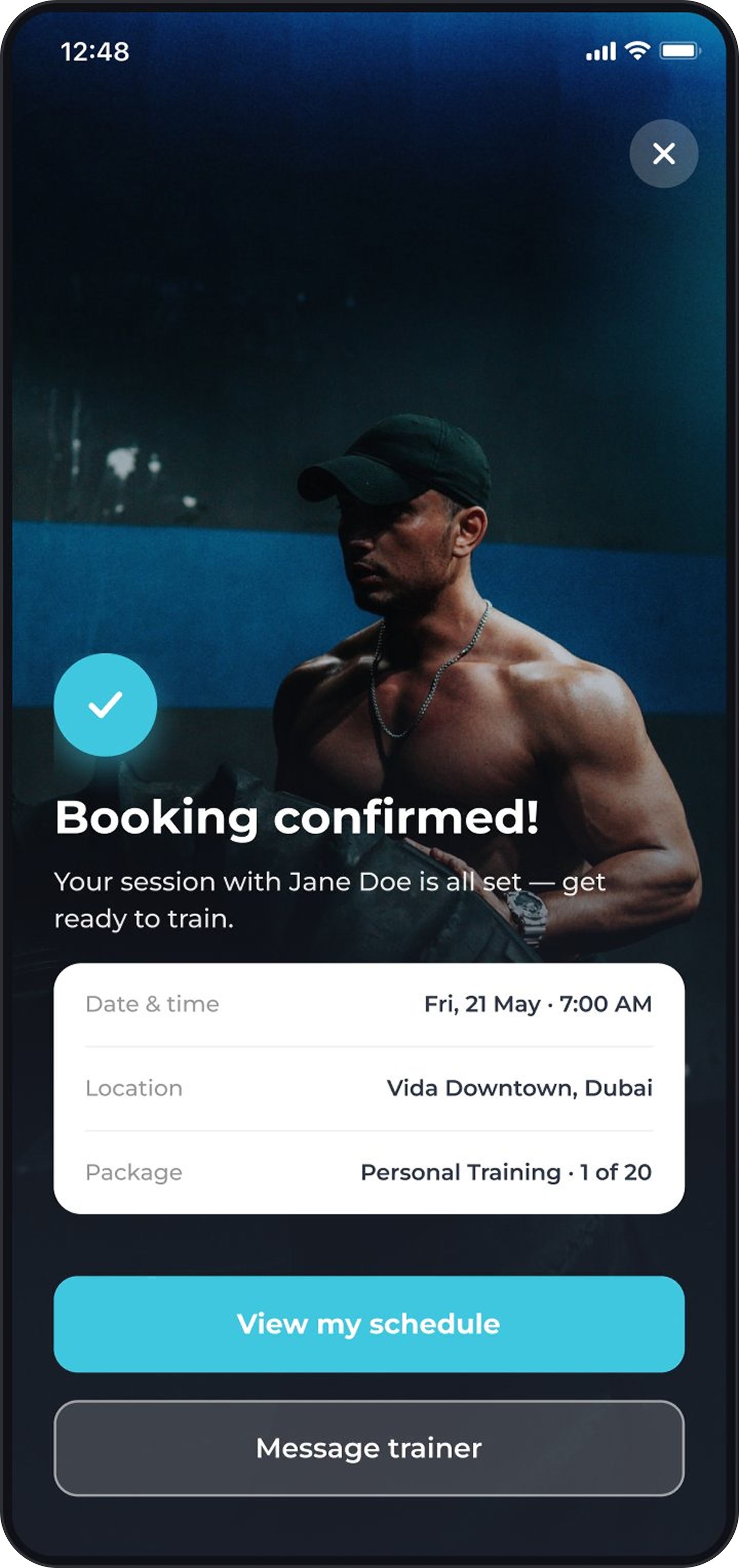
Minimal steps and clear confirmation, architected to scale into yoga, boxing, swimming, nutrition and massage.
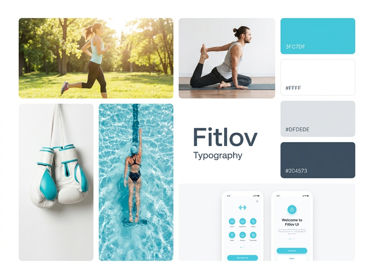
05 · Design system
Before the first screen, I built the foundation, colour, type, spacing and a component library. Every screen in this case study is assembled from it, which is what let the product scale across categories without losing consistency.
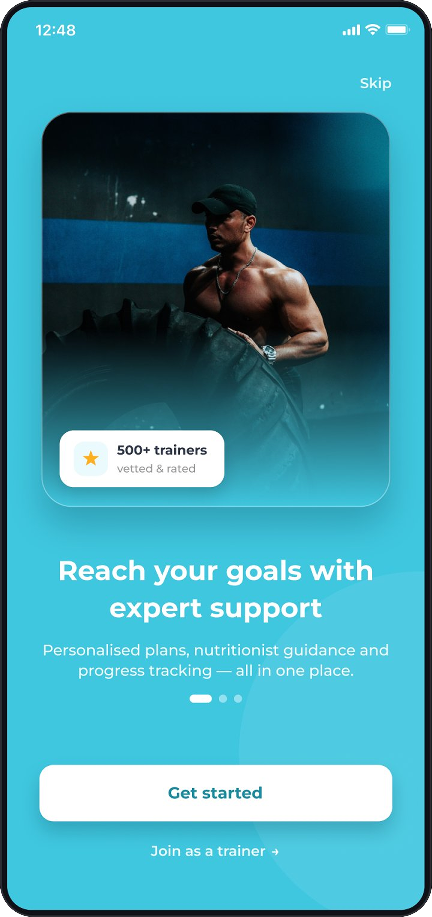
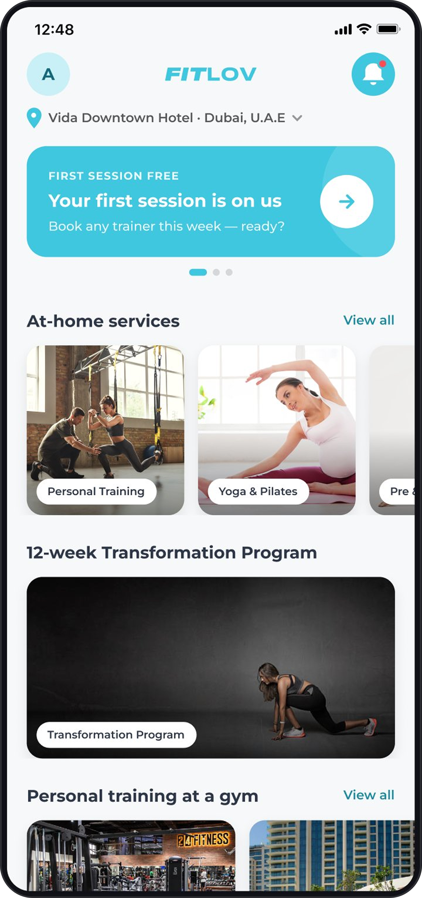
06 · The product, screen by screen
07 · The other side of the marketplace
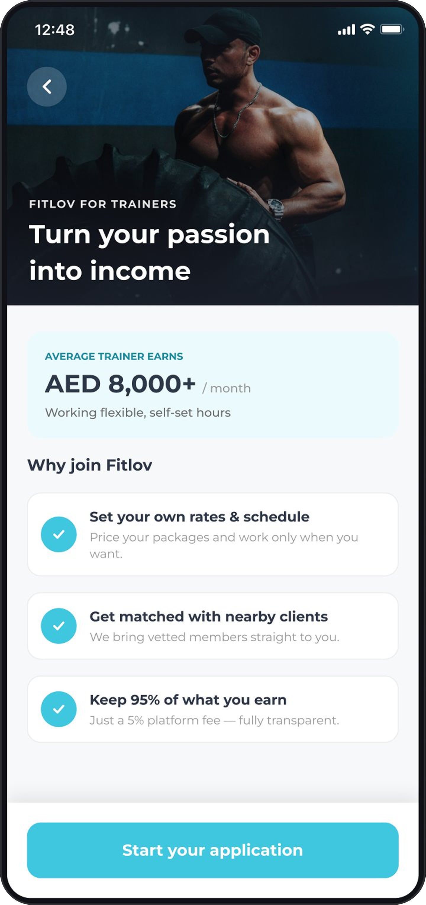
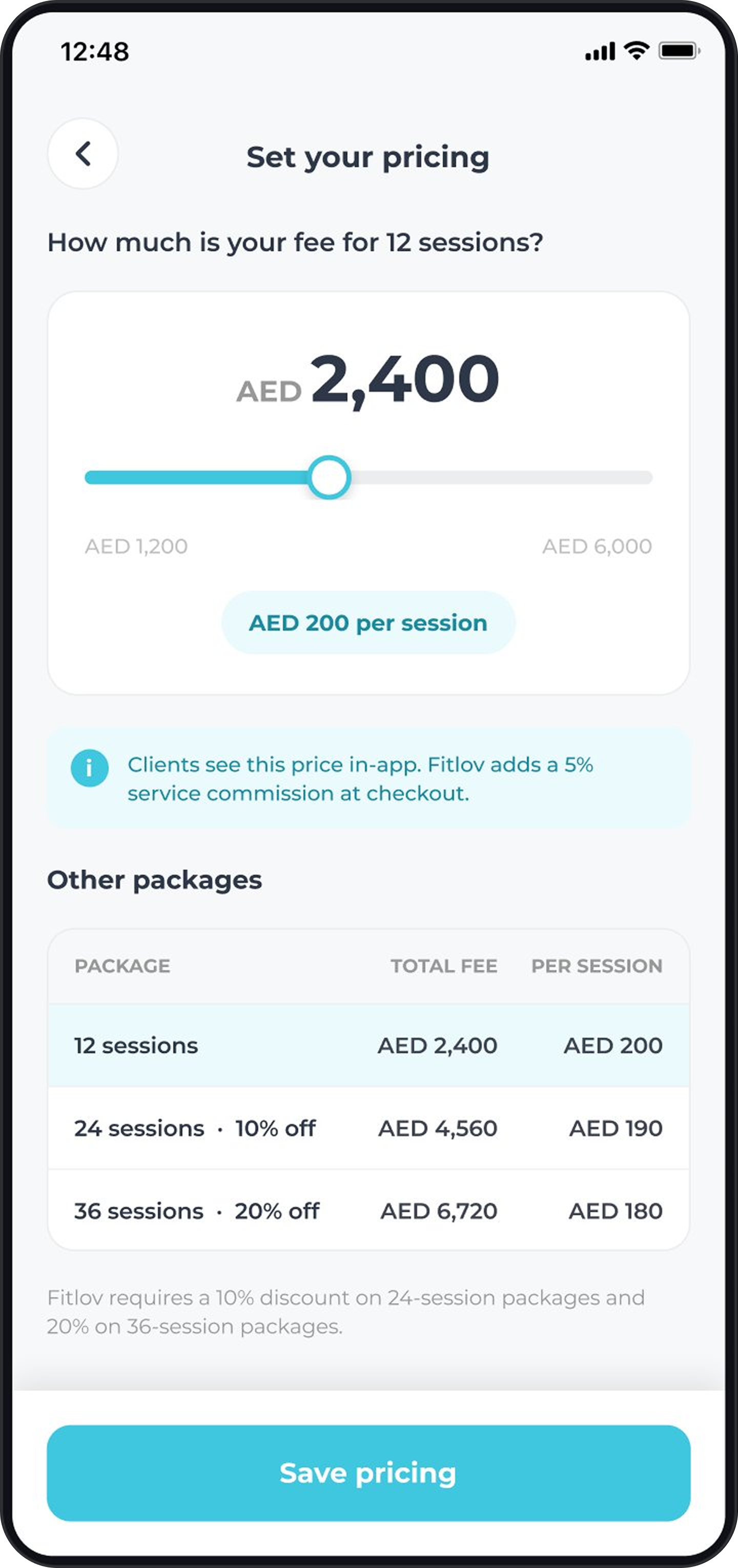
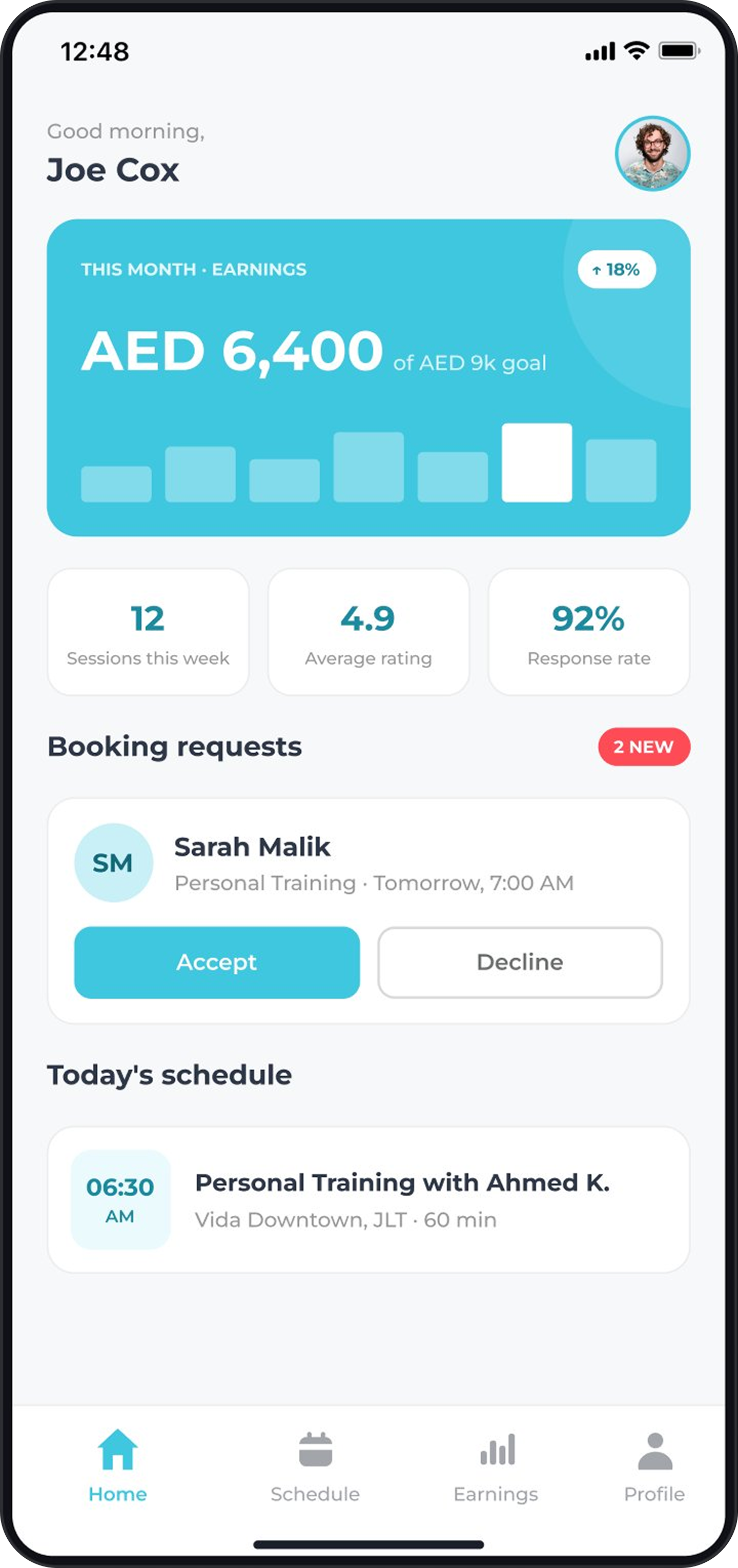
Fitlov only works if trainers do. The product was two-sided from day one, a complete toolkit for running a training business from a phone.
08 · Impact
Figures sourced from public reporting (MAGNiTT, Wamda, App Store), internal data available on request.
09 · Learnings
Trust is the core product in a service marketplace. With no physical product, the design itself carries credibility, structured profiles, clear credentials and a consistent visual language are the product, not nice-to-haves.
A design system is a business asset. Building the component library from scratch meant every new category or screen could be assembled consistently and fast.
Complexity is absorbed by the designer, not the user. Many categories, trainer types and booking states, the user should never feel any of it.
Full UI screens, the design system and process artefacts are available in a live walkthrough.